World & Country Population Map
Introduction
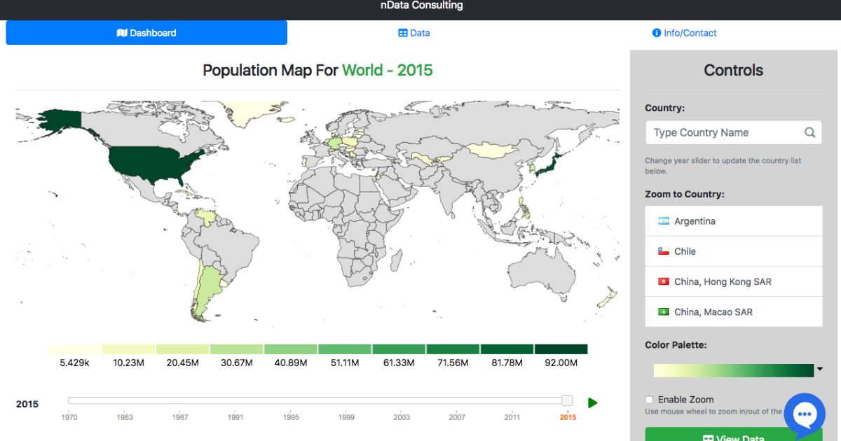
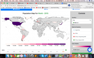
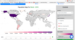
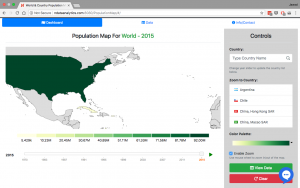
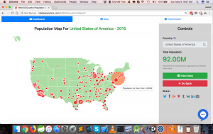
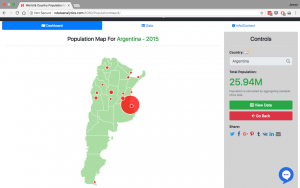
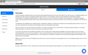
This World population dashboard allows to interactively explore global population data from years 1970-1995 for over 200 countries. This dashboard allows you to dig deeper into each country by visualizing population data for each city. This visualization uses census data collected by United Nations Statistics Division(UNSD). This dashboard integrates data from multiple sources to provide a unified picture of global and local population. This dashboard integrates country codes data along with location data for major cities of the world for each country with census data.
Video Demo
Youtube Link: https://youtu.be/bb0nElQN3BY
This dashboard uses DataMaps for the mapping solution, MongoDB as a database, Java Spring as a backend and Javascript/jQuery/d3.js code for front end.
If you are interested in technical details about what type of plugins i used? How i customized them? How i used different plugins? How i tackled a lot of problems then scroll down to the detailed technical information section below.
Feel free to contact me at jawad@ndataconsulting.com if you want to discuss any project i can create for you based on your needs and data. I am always looking for freelance or consultancy based work/projects so feel free to drop me an email and we can discuss from there.
You can find the actual visualization at the link http://bit.ly/2HSeHEj. Also, you can see screenshots and more information at behance here
NOTE: You are welcome to share this dashboard with others but if you want to use any part of this dashboard for your own visualization please contact me first to get permission.
About Me
My name is Jawad Rashid. I work on multiple roles as Data Scientist, Web Developer & Game Developer in my company nData Consulting. I love to work on data visualizations and interactive dashboards along with working on interesting problems in AI and machine learning. The reason for making this dashboard was to showcase my skills as a Full Stack Web Developer and as a Data Scientist. Also, one main reason for me to do this dashboard was to learn more about d3.js v5 and use DataMaps in a project. I will be making dashboards like these in the upcoming weeks using technologies like React, Vue.js etc, along with multiple d3 based libraries like nvd3 with different types of backends like ruby on rails, python frameworks etc with different databases. So stay tune for more dashboards from me in the coming weeks.
Screenshots
Contact Info
You can contact me or see my work by using any of links below:
- Email: jawad@ndataconsulting.com
- Facebook: jawadrashid2012
- Twitter: @jawadrashid
- Behance: jawadrashid
- Website: www.jawadrashid.com
- LinkedIn: jawadrashid
- Youtube: Jawad Rashid Channel
- Github: jawadrashid2011
- Instagram: jawadrashid
Also here are my company contact links:
- Email: info@ndataconsulting.com
- Facebook: nDataConsulting
- Twitter: @nDataConsulting
- Behance: nDataConsulting
- Website: www.ndataconsulting.com
- LinkedIn: nDataConsulting
- Youtube: nData Consulting Channel
Technologies Used
- BACKEND: Java Spring, MongoDB
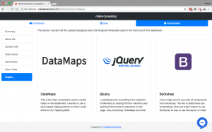
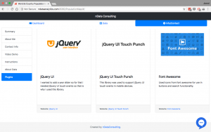
- FRONT END: DataMaps, jQuery, D3.js, Bootstrap, jQueryUI, FontAwesome, jQuery UI Slider Pips, EasyAutocomplete, DataTables, Social Share Kit, Loading Overlay, Lodash, D3 Legend
Detailed Technical Information
- Why i choose to make this visualization?
- I wanted to showcase my skills as a Data Scientist in dashboards and data visualization so that is why mainly i decided to make this dashboard. The main reason for this was so i can learn about making dashboards and attract work on visualizations and dashboards by showcasing my skills. Also, i wanted to work with recent version of D3.js v4/v5, work in DataMaps, and get experienced in created dashboards. Also, i saw a map visualization and i thought that i could make something like that. Initially i had thought about just replicating the work of someone by using my skills and my code but later on as i started work this dashboard i started getting ideas and decided to customize it and add details based on my thoughts. Now this dashboard is very different from the map i saw and is my own creation.
- Have i done something similar?
- How i started making this dashboard?
- Initially i decided that i wanted to make a world map where i could somehow zoom into countries level. I wanted to be able to select the country i want to zoom into and explore the data in an interactive way. Initially i wanted to created a map using DataMaps that would show me the value i am interested in using colors intensity and choosing a select of countries would allow me to zoom into map for further details. I had at that time no idea what data i was going to use or what kind of things i will include in the final visualization.
- How i selected my dataset?
- I choose to search for world related data where i could zoom into country level. Someone had already created similar map with imports and exports and i wanted to do something similar but with different dataset. So i decided to search for dataset and i finally found this census dataset for world population at UNData website here. This dataset is published by United Nations Statistics Division(UNSD). This dataset has cities data for 200+ countries. So i decided to take this dataset and aggregate the cities data to calculate countries population and use the cities data for drill down maps.
Data/Backend
Once i decided the dataset i needed to process the data and bring it in a database. I got the data from the website in csv format. I data cleaned it to remove any unncessary columns or rows and then imported the resultant data in MongoDB. I choose MongoDB as it was easier to get up and started with mongo and mongo has import utility which allows import csv into a Mongo collection.
- Next, i had to decide what server framework to use to communicate with Mongo and expose as a rest service to the front end. I have already some thing similar for another project i imported the data in MongoDB and used Java Spring to create a REST api on top of the database to expose needed functionality to the server. Though there were many other options i could use which have used earlier to communicate with Mongo like ruby on rails, python, R or other frameworks but i choose Java Spring as it was easier for me to get started and i have already made few projects in Java Spring.
- Once i choose Java Spring i used Spring Boot to get started as spring boot allows to get started easily and has projects for REST, security, JPA, and more. So i choose to use Spring Initializr https://start.spring.io/ to generate a basic Spring boot application with Spring Web, Rest, Security, HATEOAS, and Spring Data Mongo to get started on my backend.
- Once i got the application i wrote a model which mimic my Mongo collection for the dataset i imported. This way i would be able to get results from Spring Data Mongo. Spring Data Mongo is a very powerful project which allows to easily get started with just writing a model and repository and you don’t need to write any more code for communicating with the database or write any queries.
- It helped me to use JPA layer and Spring Data Queries so i can get results from the database quickly. I wrote Spring Data Queries(documentation here) which allowed me to just define what kind of results i want and Spring Data handled the implementation for these methods itself. One of the functionality i needed for the front end was that i needed to use Mongo DB aggregation to be able to get country population. As the dataset contained only cities population i had to aggregate cities population to get countries population. On a side note i wanted to create this dashboard quickly so i decided to go for the aggregation route so that is why the country population are highly inaccurate as for some countries there is very less city data so the country population is very very less. I could have resolved this problem by looking for a dataset which had population for countries but i decided that for this dashboard it was enough to aggregate cities to get countries data.
- In order to get the country aggregation i choose to write a controller method with mapping to rest api following advice from this great article http://www.baeldung.com/spring-data-mongodb-projections-aggregations along with articles on MongoTemplate in Spring to write different stages of Mongo aggregation. As i have in the past written mongo aggregate queries in json format i was very comfortable with writing different stages of aggregation using MongoTemplate.
- Before i develop the code in Java spring using MongoTemplate i wanted to first write a query in Mongo json format in order to visualize what kind of pipeline stages i needed and what will be the result of each stage and how to get appropriate results. I could have written the code in json and run it directly from Mongo shell as i have done in the past but i felt that there had to be a better way so i looked for free and open source solutions softwares which could allow me to visualize the pipeline methods in graphical form and make it easier to see the results and write the stages. I looked at many solutions but some of the solutions which could have worked were paid. Finally i found NoSQLClient(https://www.nosqlclient.com/) which had GUI interfaces and had a module where i could add multiple pipelines graphically and then write the pipeline json in those pipelines and see the results in better format. I was looking for solutions for Mac as that was my main development environment. There were other solutions but they allowed me to only graphically write simple queries where NoSQLClient allowed me to write aggregation queries and drag and drop stages as i wish.
- Once i developed the pipeline stages including project, group and other stages to get the results in correct format i was able to get countries population data. After finding all the stages and parameters i needed for each stage i was able to follow the MongoDB aggregation spring article i posted above easily to design the code for the aggregation in Spring. It was rather very easy from here on. One thing that i needed to do was that in the aggregation i needed some other class to store results as the results had different columns then the Mongo model file i created and it needed very few columns so i decided to write a new class with fewer columns to store the results for the aggregation and exposed the results as a endpoint using Spring RequestMapping functionality.
- I also needed to make custom query using MongoTemplate to return the countries result in the format i wanted so i decided to write another controller method similar to the country aggregation method except in this method i did not need to aggregate the results instead i only needed to filter the rows based on selected country and year. The steps were similar as i had already created results using aggregation framework.
- In order to test the rest api i choose to use Postman(https://www.getpostman.com/) as it helps me a lot in API development or testing already created API’s. I tested the Spring API using Postman to make sure i was getting the correct results. It was very easy to use Postman to verify that i was getting correct results indeed in JSON format.
Front End
- With some back end functionality completed i choose to switch gears and work on the front end. I decided to select DataMaps(http://datamaps.github.io/) as that fit my needs very well and for this project i wanted to use D3.js. I wanted to use the latest version of D3.js which was D3 version 4 with Datamaps(At that time D3 v5 was not released. Near the middle of the project D3 v5 was released so i choose to switch from D3 v4 to v5 as there were minor changes). The only problem was that Datamaps supports D3 v3 only and does not support D3 v4 currently as you can see in this Datamaps issue https://github.com/markmarkoh/datamaps/issues/320. It is understandable as it is not trivial to move from D3 v3 to D3 v4 as D3 v4 is more modular and moving from these versions require a lot of work. So i was stuck in using D3 v3 as Datamaps supported it only. I have worked with D3 v3 in the past but i wanted to use D3 v4 as well in the project as i wanted to learn newer things in D3 v4. So i choose to follow the advice here https://stackoverflow.com/questions/16156445/multiple-versions-of-a-script-on-the-same-page-d3-js#16156569 in this answer where someone proposed to include multiple versions of d3 in same page with different prefixes. So i choose to import D3 v4(now v5) and save it as a separate variable i.e. var d3v5 = d3; and imported d3 v3 and allowed it to use d3 prefix. This way Datamaps continued to work with d3 version 3 and if i needed d3 v4/v5 functionality i could just use the variable i saved for d3 version 4.
- For this project i decided to create a simple project written in d3 and jQuery and choose to include dependencies manually. I choose not to use ES6 as i would have to use webpack or some other package manager and i did not wanted to get stuck with a package manager for this project as this was meant to be a quick project. In the future as i will develop similar projects using React, Vue.js and Angular i will use webpack or similar package manager but for this project i choose to not use a package manager to make the setup easier in the beginning and also because the project is not full fledged and not too complex. I would recommend to use a package manager if you have a larger project. For my ionic app i am using webpack and i have used webpack and systemjs with angular applications in the past.
- I choose to use Bootstrap as my css framework as i have experience with bootstrap 3 and i was excited to learn Bootstrap 4 as i learned that it supported flex and was built with flex containers in mind. I had invested time in learning flex few months ago as i felt that many times i was stuck in designing my UI i would stumble upon a stackoverflow solution to my css problems using flex so i decided to learn flex and i would recommend all web developers/designers to learn flex as it helps to make your design cleaner and easier without worrying about relative or absolute positioning and float containers and another advantage of flex is that it has now high support in major browsers. I would recommend anyone to use Bootstrap 4 as it makes development easier as bootstrap 3 as it makes codes easier. Also, they have introduced some new things which are very useful.
- I choose to select a basic bootstrap template example with nav bar and built my UI over that. Initially i selected bootstrap starter template https://getbootstrap.com/docs/4.0/examples/starter-template/. Later i tried to use bootstrap dashboard template https://getbootstrap.com/docs/4.0/examples/dashboard/ but felt that it was not suitable as i needed room for my controls and slider bars etc and it was not very easy to customize that based on my needs.
- I created a basic DataMap map and try to arrange controls using bootstrap. I struggled to find a suitable place for the controls as i tried to place the controls underneath the map but the controls were either too large or there was a lot of space. I was not able to come up with a great UI underneath the map. Later on i created a sidebar on the right and put my controls there.
Country Auto Completion
I needed a way to select country for which i can show more detail. I looked at using select elements in the beginning but felt that the UI would be very poor with 200 countries in the dropdown. So i decided that i needed a dropdown and that dropdown could work with local source and can be responsive. So after searching i found EasyAutocomplete http://easyautocomplete.com/ which allowed me to select a dropdown using autocompletion and provide it the countries i want to be searchable. I choose to customize the dropdown by writing a wrapper above it as i wanted the dropdown to be a separate module and wanted enhancements. I had to make multiple enhancements to make it even more customizable. I found flag icons from easy autocomplete example as well which i choose to show above the autocomplete for countries.
DataMaps Issues
- For DataMaps one issue i came across was that in my dataset countries were represented by their name and 3 digit ISO code e.g. ISO Code 840 for America and in Datamaps to show different colors for different countries it needed 2 alpha ISO code i.e. alpha code US for America. So i needed a mapping from 3 digit numeric code for countries to 2 and 3 alpha code for countries. You can view the code list here http://www.nationsonline.org/oneworld/country_code_list.htm and understand what i mean. So i needed such a list in json format. I found this list here https://github.com/lukes/ISO-3166-Countries-with-Regional-Codes where someone has scraped ISO public website and extracted country names, codes alpha and numeric and more information about countries. So i decided to use this list and import it in my code for translation from one code to another for use with Datamaps.
- Later on another issue i came across was that i wanted to zoom into countries and show population at cities level. Datamaps has some basic zoom functionality where you can provide world scope and zoom into coordinates and scale and it zooms to there but as such no countries zoom. For that i looked at using custom map data in Datamaps https://github.com/markmarkoh/datamaps/blob/master/README.md#using-custom-maps which explained that in order to zoom into country you need to define a custom topo json file for that country which has boundaries for that country only and also needed center longitude and latitude to zoom into and scale to zoom into. It showed India and Canada examples.
- The problem was that the topo json is not easily available instead as the guide explains that you need to get the {xyz}.topo.json file from datamaps source folder where xyz is a country in 3 alpha form like usa and then find the Datamap.protototype.{xyz}topo json variable which contained the map coordinates for that country and change some variables. The problem was that this process required doing this for 200+ countries. So i decided to write server code to do all that automatically. I moved all the topo json files to my server. Then based on the country code i would read the appropriate datamap file and using regular expressions extract the map json formats for that country. Finally i needed another regular expression to make the json keys correct as given in the datamaps custom maps guide. With the json extracted i would create a json file and send it to the client. With the json file datamaps could draw the country selected using data url for the json file. Once i generate this file i would not delete it and if the file was already created then i would use that file. Later on i found this dataset (https://github.com/mledoze/countries/tree/master/data) which contained the topo json files i needed but i had already written code to do that so i was not able to use these files. My initial search did not revealed these files only near the end of the project i found these files.
- This resolved one problem of getting each country map data but another problem was that Datamaps in addition to the url also needed a center and a scale. For center of each country i thought about using geocoding libraries so that i could give it country name and it would give me the coordinates and i could use that but that i thought about looking for a dataset which had centers for each country already calculated so i would not have to write geocoding and cache those results. One options was to use Google Geocoding API but looking at google API it was clear that it allowed 2500 requests/day which was not an issue for countries if i cache results and store them permanently but Google geocoding API also stated in their policy(https://developers.google.com/maps/documentation/geocoding/policies) that you can’t use the data from geocoding outside google maps. I found more articles for list of countries and their centers here (https://stackoverflow.com/questions/2702309/need-a-list-of-all-countries-in-the-world-with-a-longitude-and-latitude-coordin) but they all required either use geocoding libraries or a lot of processing to get the approrpriate data. I finally found this list (https://drive.google.com/file/d/0B52RjTfri3LPNDFuc0JHRDkxNE0/view) which someone here referenced which resolved my problem. This list gave me longitude and latitude for every country.
- I used this dataset for Datamap centers but there was still a problem with the scale as each city would have different scales. There were two ways to find this scale. The recommended way was to first draw the map for the country using scale of 1 and find a bounding box containing all the points and then scale that bounding box to the available width and height and from that scaling you would get the correct scale for the country. I would have loved to use this method but i was not able to find much code on this and i would have to look for a lot of code and write the code myself and i felt it would take a lot of time to understand how to do that correctly. Also, there was scale parameters in the topo json files as well which needed to be taken care of and i didn’t understand these scale factors and bounding areas too much to go for this approach. So i decided to use another way which was time consuming but i felt less time consuming than writing the automatic approach i have given above. That approach was to for each country show the map with some scale and then based on the result manually update the scale so that whole map for the country is visible. It took me few hours to find scale for each country and hard code it in the data but after i did that this approach worked very well as i was able to approximately draw the map so that it showed at least correctly.
- Another problem was that Datamaps don’t have any zoom functionality by default but as it is D3 code you can use D3.js zooming to somehow zoom. So i decided to implement basic zooming using mouse wheel using D3.js zooming. Someone had posted in Datamap issues with zoom examples https://github.com/markmarkoh/datamaps/issues/372 and http://jsbin.com/boribamugo/1/edit?html,output but these examples only allowed to zoom in i wanted to be able to reset the zoom if i want. The problem was that if you try to just scale and translate the svg zoom element manually then it would correctly reset but if you touched D3 element again to zoom again it would jump to last zoomed value and it resulted in lot of problems in reseting zoom. For that i followed solutions to D3.js zoom reset in these links https://groups.google.com/forum/#!topic/d3-js/-qUd_jcyGTw and https://bl.ocks.org/mindrones/3e775233c1417caf7d7e which resolved my reset zoom problems.
- Later on when i created zoomed in country datamaps with cities population i came across another problem that this time i had the name of the cities and their population from the main dataset but i was missing the longitude and latitude of the cities. I needed geo location to draw circles on the cities. In order to resolve this i tried to looked into geolocation again. So if one city was geolocated from an api once i can store the results permanently in database and retrieve it next time location is requested instead of asking for geolocation api. This time i had to geolocate around 25000 cities total. Google geocoding was not suitable due to 2500 requests/day + restriction to use with Google maps only. I looked into other free options and found these options:
- LocationIQ with 10000 requests/day limit that would mean i would be able get results in 3-4 days but it felt still a lot of work.
- I also found Nominatim and OpenCage Geocoder API with either similar problems or restrictions or too much murk
- I finally decided to look into finding dump of location data. I found the following dumps
- Maxmind dataset but the problem was free dataset had very limited number of cities https://www.maxmind.com/en/free-world-cities-database
- Other libraries but there was one problem on another.
- I found then Geonames dump (http://www.geonames.org/export/) and looked into download options. There was a AllCountries.zip which was huge database of locations in each country but these locations had mix values they had cities and places merged in. After more research i found that geonames has Cities1000.zip which contain geolocation for a lot of cities with population > 1000. So i chose to download that and imported it in excel first. Then i removed all countries that were not in my main dataset and removed columns i did not need. Finally, i added country code in this dataset from the country codes alpha to numeric list and finally i exported it in csv.
- It was still few MB’s of data. I tried to use that and it did work for my dataset as it would search for a lot of cities. There were some cities which had different values then in the main dataset but it was still retrieving a lot of results without any processing. The main problem was that this file after filtering out rows and columns was a 25MB file and it was very expensive to load this every time. So i decided to go back to the drawing board. I wrote a python script which found all the location data for each country in separate lists and i split them up into separate smaller csv files for each country this helped as i can load only the csv file for each country which was much smaller. It was maximum 0.5MB for largest country. So i used this dataset to match cities with their location.
Year Slider
I wanted to use a year slider to explore population data for countries and the world maps. There was few restrictions for year slider i wanted. One was that it had to be responsive so it would stretch or shrink based on available space. Also, another requirement was that not all countries had data for all years. For example some countries had data for 1995, 2007, and 2015 and no data in between so i wanted a slider where i could only select the years i give it and not values in between. The normal html slider would not work as it was not responsive as much and also for normal html5 slider the step are fixed so i could not do something like years 1995, 2007 and 2015. I looked at other sliders. I found one bootstrap slider which could have worked (http://seiyria.com/bootstrap-slider/) but the problem with this slider was that it worked only for bootstrap 3 and was not fully compatible with bootstrap 4. After finding a lot of sliders but that violoated the restrictions i had i found these two sliders http://ionden.com/a/plugins/ion.rangeSlider/demo.html and http://www.bestjquery.com/?jpubA5it. Both of them were responsive and both of them allow custom slider data like giving values and it would show only those values. In the end i found jQuery UI Slider to be the better option due to customizability so i chose that. This slider allowed customizability of number of ticks and giving custom data. I had to write code on top of that to make it a more responsive so for medium screens there were lesser ticks so it was readable and for smaller screens ticks would decrease so that it was understandable. This worked after customzibility. One problem in the year slider i faced that because of things i was using i was not able to get the slider to update correctly if i chose to change the years and the tick marks on the fly from one set of values to another as the refresh code provided in the documentation updated the ticks but not the data correctly. So i had to destroy and recreate the slider every time new data came in for the slider(Not a great solution but worked fine in this case). Another issue was that as this was touch based slider it was not working in mobiles. So from past experience i included jQuery UI Touch Punch code (http://touchpunch.furf.com/) which allowed mobile support for jQuery UI touch controls which fixed my problem with mobile.
Other Changes
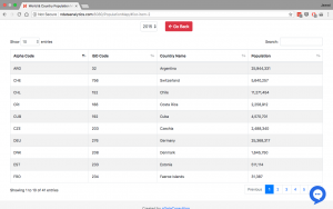
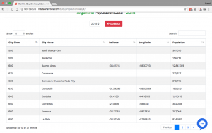
- I wanted to show the data in tabular form also so for that i looked for responsive tables with custom source and a lot of options of customizability. I found DataTables (https://datatables.net/) which are responsive and can accept data on the fly so you don’t have to hard the data or the columns and allow local data. Also, there are a lot of plugins in DataTables. I was impressed with DataTables. I did not use a lot of plugins as it was overkill for this project but these DataTables are great. Also, if you define a table once and want to update the data with new information you can just clear the datatable with their api and add new data.
- I found that for some reason DataMaps legends were not working. I saw that it was not a problem in my case only but other examples on the web for DataMaps had no legend working. I found that in previous versions legend used to work but was not able to find out why it was not working. So in order to show legend i found this plugin for D3 named D3 legend (http://d3-legend.susielu.com/) which allowed to accept a scale as input and number of symbols to show and can draw the symbols with given width/shape. This worked fine but as such is not responsive by default. I had to write custom code which found out the discrete population displayed on map. If it was less than 5 points i would fit those many legend shapes on the page stretching them to fill the space by calculating the width for each shape through formulas. For many population points i capped the symbols to 10 shapes maximum and tried to fit as many shapes as possible by changing the width of each shape based on available width. On smaller screens i would draw small number of symbols. As such the D3 legend accept the width of shape and how many shapes but could not calculate the optimal number of shapes and width based on available width so for that i wrote custom code.
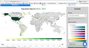
- I used D3 v4/v5 scales to translate from range of population to color. For the choosing colors i used D3 color scheme interpolators and was able to map range of numbers to range in a color scheme. This allowed me to give the scale a color scheme interpolator object and it would map population to correct color. This gave me an idea to make a dropdown with different color scheme from d3 scale chromatic https://github.com/d3/d3-scale-chromatic and selected those color schemes which worked well for the map. I wrote custom code to show pictures of color schemes in dropdown and on clicking on a color scheme update the color scale for the Datamaps by giving it new colors scheme D3 object. This was a great experience for me to think of an idea and implement it myself.
Other than that there are plugins for sharing, chat etc which are easy to understand. There was room for a lot of improvement and there are some minor bugs but for a demo project this is good enough. I could have found a dataset for population of cities which was more accurate instead of aggregating cities. Also, i could have added graphs to go along the visualization but choose to not to do that as i have already done in a previous project here http://ndataanalytics.com:8080/ClusterWebProject and also i was out of time. There are a lot of optimizations but for now i am finished with this dashboard. This was a great learning experience for me. I will be creating more dashboards like these but with different designs. My thoughts are that in the upcoming months i will make these dashboards but each with different mapping libraries like Leaflet, google map, and other libraries. Each different databases then Mongo like trying Graph databases and other databases and each with different front technology like React, Angular, Vue.js etc and different server framework like ruby on rails, python frameworks, R, etc. I would like to do similar work in dashboards, visualizations and data analysis as that is my main focus as Data Scientist. If you want to discuss any projects you have which i can work on please contact me at info@ndataconsulting.com or use my other contact information given at start of this blog post and i would be happy to discuss prospective project i can develop for you.
