My Own Facebook & Twitter Network Analysis
I wanted to use Gephi to analyze my twitter and facebook data. I wanted to analyze my connections or any data i can get from my own data. One approach to use my own data which i thought about was that both Facebook and twitter allow your data to be downloaded and twitter nicely gives a csv format with all the tweets. That being said the problem with using that data was that the format for the data was in excel and was not in nodes and edges form. That is another project that i will explore in the future to parse interesting things from my own data but right now it was too much work to convert the data in nodes and edges format needed for Gephi.
So i moved on to the second approach to use tools that extract some information from facebook and twitter profiles. For facebook i found an application by the name of netvizz which could get a lot of information but i found that it was easier to use likes and personal activity data to analyze as that was easier to access and process as they provided a single file for that otherwise there was much more data i could explore but that data was provided in separate files so i choose not to use that. I choose not to do twitter analysis due to shortage of time. Also, i choose to use only pages like data for my network for analysis at this time. It made sense to me use directed links as a friend would like a page and the reverse was not possible that is a page would not like a friend. I could explore further if using an undirected graph would make any impact on the results i reported below.
Likes Data(no mutual friends link)
Now let’s start with the analysis on Facebook data. The first type of data involved my friends and likes as nodes where the edges represented which pages my friends have liked. The data was huge with 5000 nodes and around 6000 edges. Here are the results:
- First thing i noticed was that the data was for around 100 friends of mine. That being said netvizz did not find made any edges for mutual edges so basically i got a lot of graphs for each friend and some of them connected as they shared common friends. I choose to do one analysis like this do understand the network and then i manually looked at my friends list and added links between mutual friends to make the relation more interesting. For no there are no mutual links between friends. Later on in an another report i will explore what happens if i include mutual friends links also between them.
- Diameter measure gave a value of 1 and that made sense as the friends were not interconnected.
- Average degree for node was 1.19 which suggested there were common pages my friends liked.
- Graph density was zero as it measures the ratio of edges in graph/potential edges. As 5000 nodes can have a lot of edges 6000 was too small.
- I choose to find components and hide which were not part of the main component but that didn’t help.
- So i choose to use modularity analysis to find communities and it revealed something interesting there were around 39 communities which was suprising as there are total 100 friends and that i beleive due to sharing of the likes between friends. I choose to explore this further.
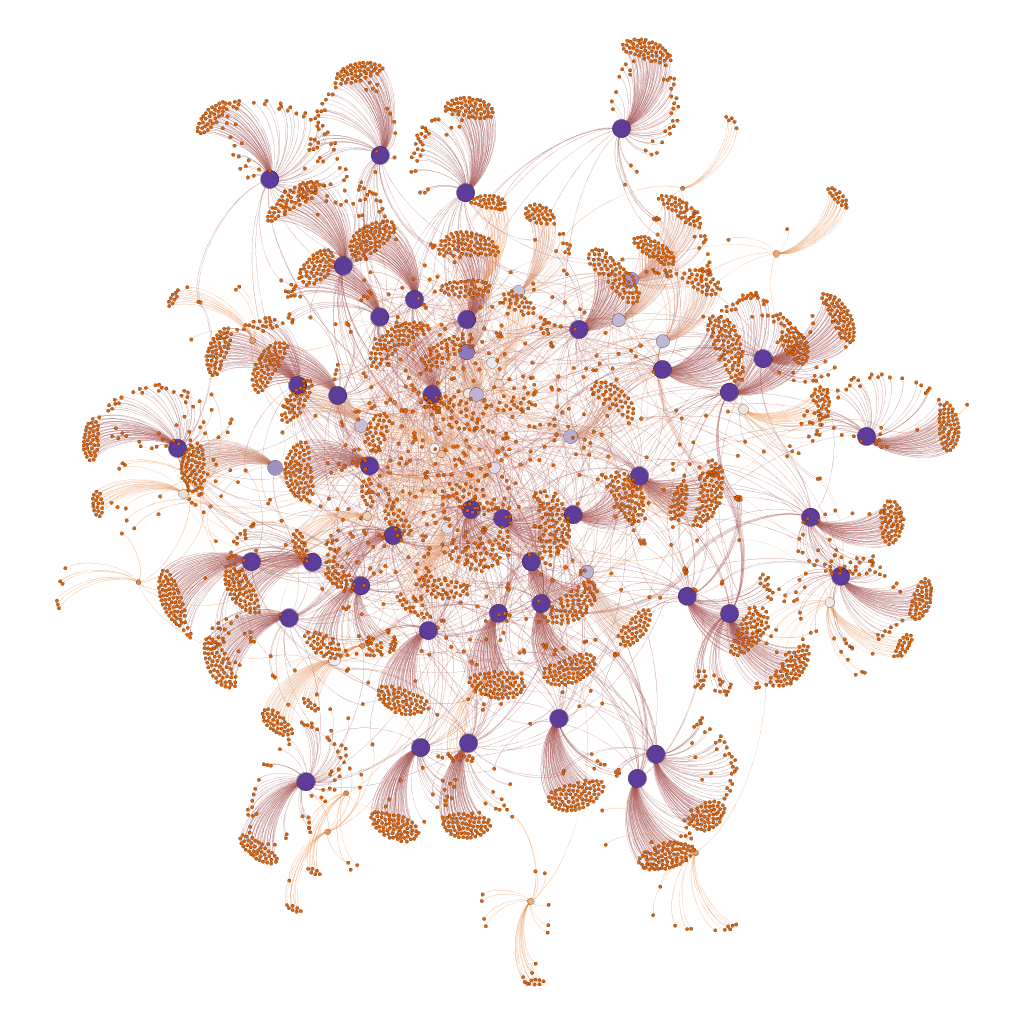
- I choose to color the nodes by the degree of the nodes and the friends with a lot of likes were highlighted. This helped me to explore further. You can view the graph below. I choose not the label the nodes to keep anonymity.


- In the above graph the size of the nodes are based on the degree of the nodes that is the connections each page or friend have. When i did this i found that friends who liked the paged became more visible as purple large circles. Whereas lighter color represented friends who have liked lower pages. One limitation which i found out was the collection tool only collected a maximum of 100 likes/friend so the purple circles with the highest intensity are all friends who have liked 100 pages and other with lower. The orange circles more and less are the pages that these people liked.
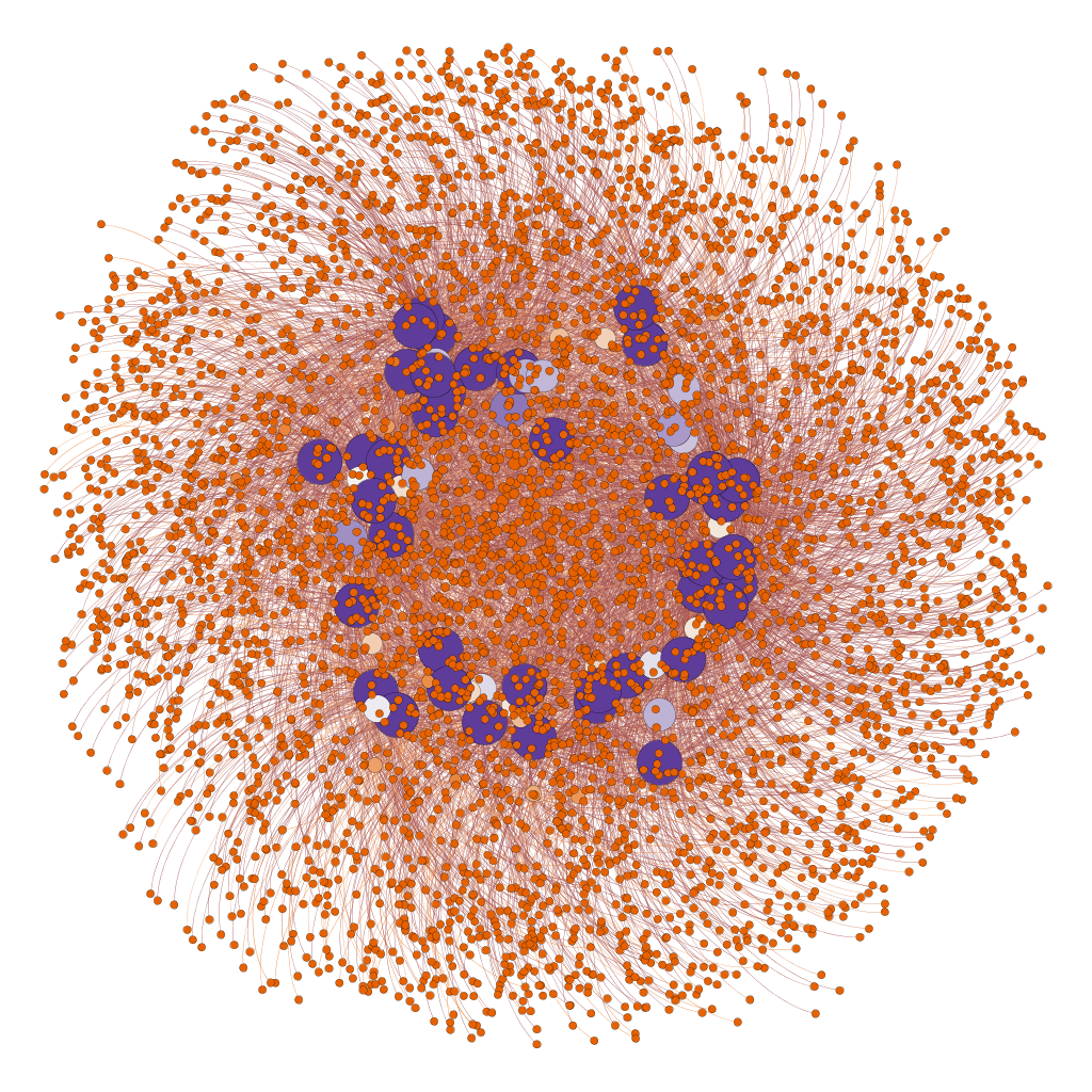
- It was difficult to see pages which have more than one like due to the size of the graph.
- On the bottom image it was difficult to see any likes but on the graph on the top with a different configuration it was easier to see chunks of friends and their liked pages and it looks there are not a lot of interconnections between one community and another.
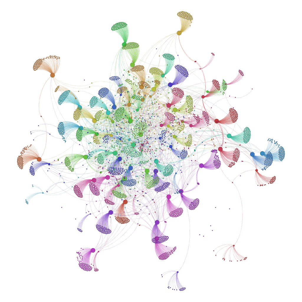
- Next i choose to use modularity which identifies communities within the whole graph and it was interesting to see some patterns.

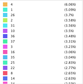
- Some interesting things to note other than the fact that the algorithm found the friends and their likes network was that there some pages liked by only two people in the network as you can see on the left side there is an orange and light orange friends with a lot of likes on pages and there is a page between those network liked by only these two people and at the bottom you can see some examples of three networks connected by a single page. Also, i am posting some statistics of the highest % in communities. You can see there are only 2 communities which have 6 & 5% which means this page is more connected with others otherwise overall there as there are difference in size of likes for communities as they go down in size.

