Integrated Gephi-Tableau Analysis of CCK11 Dataset Part 1
The dataset used in this analysis is CCK11 dataset for social network analysis (I don’t own the rights to the dataset please ask permission from @gsiemens or dgasevic before using the dataset as i have permission to use this dataset for a course for analysis in course setting only). Don’t use the dataset without the dataset owners permission. I am doing this as part of the data analytics and learning course for only educational purposes.
Sorry for the long post i know i don’t write concise and well but right now i am focusing to try to start writing more and more so hopefully with time i will write concise and to the point and only present relevant information.
In this analysis i will do similar analysis as i did previously here(with hypothetical dataset) but as the dataset now is for an actual course for week 6 and week 12 i will try to more clearly interpret and analyze the results. In my previous attempt for the hypothetical dataset i didn’t interpret the dataset much as the dataset was actually not real but in this case as dataset is real i will use that. You might be interested in previous analysis on only Gephi(LINK) i did on this dataset but now i will use Gephi to calculate communities and calculate centrality measures and then export the dataset from Gephi and import it into Tableau so i can analyze the distributions of the dataset.
The dataset was collected from a Connectivism and connective Knowledge mooc for which detail you can read here on their page here. There are 2 separate datasets and two different time snapshot for each dataset. One is the blog interactions for CCK11 for Week 6 and another for Week 12. Similarly the other dataset is for twitter replies and mentions for CCK11 for Week 6 and Week 12. The total duration of the course was 12 weeks.
Gephi Analysis
The analysis in Gephi was similar in this analysis i did with hypothetical dataset here but i will write down the main steps below for reference along with some important details.
- First the dataset was imported in Gephi as directed graphs separately for each of the 4 datasets. Nodes in these graphs are the people who participated in the course and the edges were represented a mention or link to another person or discussion with another person. Some important statistics of the dataset are given below along with some other information calculated from Gephi. Some of the important measures are listed below for each graph
- Average degree for the whole graph
- Diameter (the maximum distance in the graph between two nodes)
- Graph density represents the number of actual edges in the graph/potential edges so a graph with edges between one node to every other node will have a density of 1 and one with less connectivity with other nodes will have density closer to 0.
Dataset Name Number of Nodes Number of edges Avg Degree Diameter Graph Density
Blog Week 6 159 147 0.93 5 0.006
Blog Week 12 194 205 1.057 6 0.005
Twitter Week 6 498 749 1.504 11 0.003
Twitter Week 12 835 1188 1.423 9 0.002
- Some important points to note in the above table are.
- Twitter had a log more activity than the blog. You can see that by week 6 there are 3 times more people communicating than in blog. This distance grew even more in week 12 when there are 4 times more people in twitter than in blog. This also shows in my opinion that due to ease of use of twitter people find it easier to communicate more in twitter but that being said in blog communication you would probably discuss a lot more content and there can be more detailed communication in blogs.
- Blog people increased around 1.2 from week 6 to week 12 whereas in twitter it increased a little more around 1.6 times from week 6 to week 12.
- In the blog communication you can see the average degree hovering around 1 for both weeks so there were less interactions with other people whereas in twitter that was around 1.5 which means more communication. That being said average degree is not a true representation of the distribution and we will study it even more in tableau by using histogram and other graphs. Also, average degree increase in blog during the 6 weeks duration whereas twitter communication dropped. This is another interesting fact which we can explore further.
- The diameter is less in the blog and in the twitter it is doubled that of blog but that being said due to the increased size of the twitter graph that is understandable. That also means that there were more intermediates in the longest interaction as twitter was around 10-12 and blog around 5-6. Again we see the same behavior than in last point that diameter increased for blog but decreased for twitter. This could mean that in twitter after 12 weeks those people which were further away started communicating more with the central communication.
- Next i filtered out those node which were not part of the main connected component and there was a 30-40% reduction in number of nodes for each graph as there were many nodes which were either isolated or part of a very small group so those were removed.
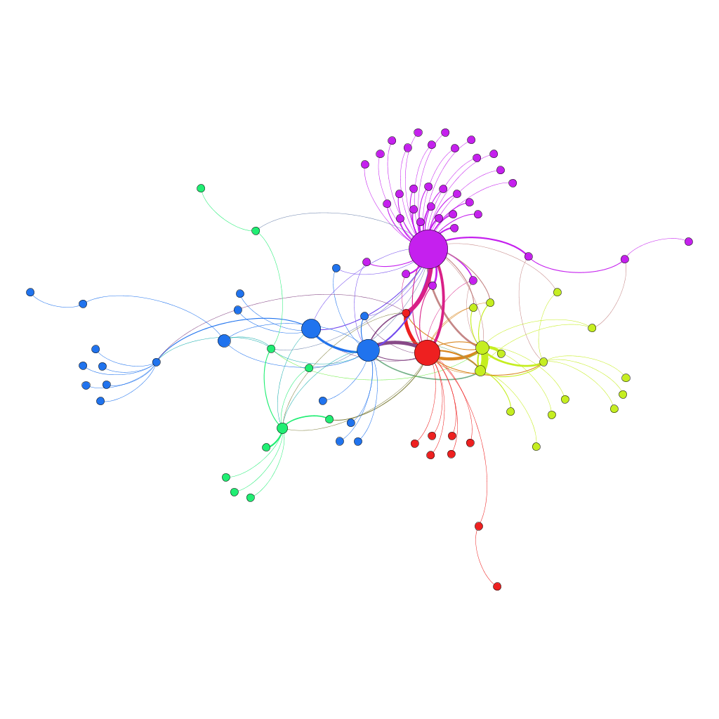
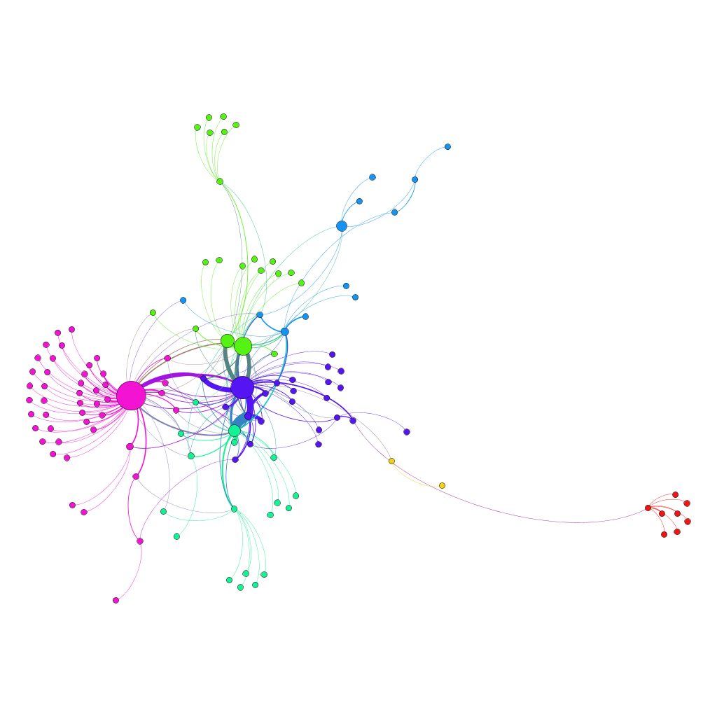
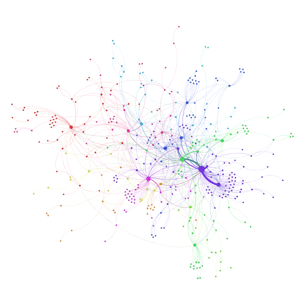
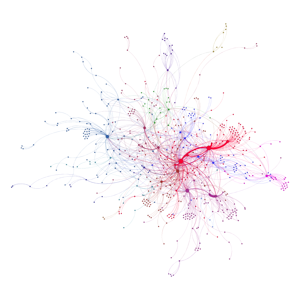
- Next, i used modularity measure to find communities in Gephi and following are the stats:
- Blog week 6 revealed 5 communities
- Blog week 12 revealed 7 communities
- Twitter week 6 revealed 11 communities
- Twitter week 12 revealed 15 communities
- We can see in both that there has been around 40% increase in number of communities for both modes of social interaction.
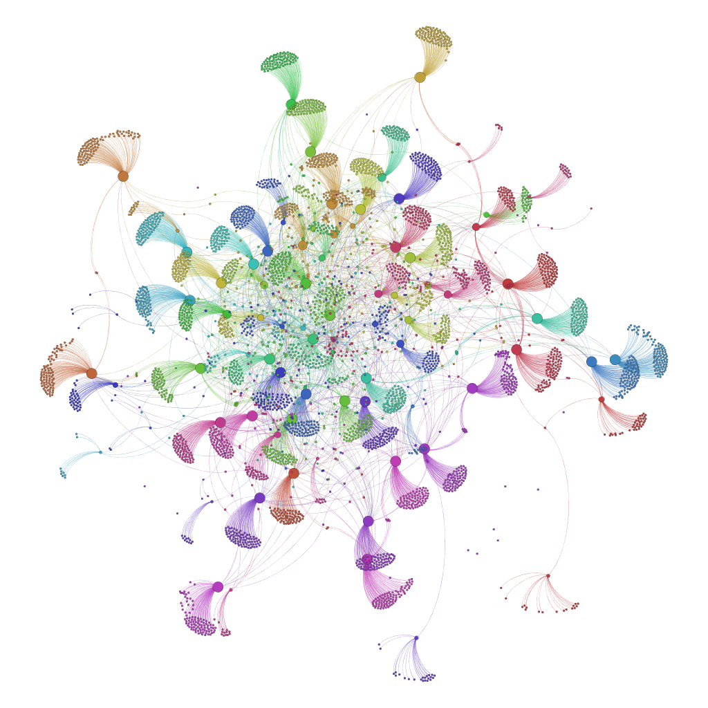
- You can see the communities below as well. With blog it was easier to see connections due to number of nodes and edges being reasonable but as you can see in twitter it could a little difficult to analyze the huge number of nodes and edges. The graphs are generated by coloring the nodes in same component in single color, the edges width represents the edge weight and the size of the nodes are scaled by betweenness. One pattern you can see in all graphs is that there is at least one communities with a lot of nodes and there are smaller communities connected with this major community directly or through other smaller communities.

Blog Week 6 Communities 
Blog Week 12 Communities 
Twitter Week 6 Communities
Tableau Analysis
That being said it was difficult to analyze the graphs so we move on to Tableau analysis to understand the distribution of each centrality measure overall and within communities as well. I will do this at a later time as i am short on time right now and need to work on some other things but i will post a Part 2 giving discussion of Tableau as well. I am studying learning analytics as an internal application we are working on is related to learning analytics so i will come back to this analysis and post more results also.
